emember back in the day when you typed out your resume on a word processor? I’m talking pre-internet, pre-access to design programs for the common people, pre-infographics. (I realize some of you are wondering what a word processor is. Call me. We’ll discuss.)
Well times have changed. Today is the era of social media and visual overstimulation. We are constantly presented with beautiful imagery, from our friends’ feeds to every piece of advertising we see around us. Our resumes should be no different.
I have recently found myself prospecting for new clients and projects and realized that I needed to step up my resume game. Because when it comes to marketing ourselves, especially in creative fields, we can no longer get away with just a plain ole’ WORD doc.
Here are some tips to make sure you stand out from the rest of the job seeking crowd.
- Include a photo.
Social media, video conferencing, and smartphones in general have made connecting easier. While many argue that the connections are less meaningful, it also allows us to create a visual point of reference. Why not do this for your next potential hiring manager? You don’t have to spend money on a professional headshot (although that is a great option). Just have your friend flip their iPhone camera setting to portrait mode and you’ll have a beautiful image in no time!
2. Add some color.
Colors say a lot about you. Add some pizazz, personality, and pigment to spruce up the layout of your CV and help break up the information you’re presenting. If you want some direction of what a color might signify about you, here’s a Psychology of Color chart you can reference.
3. Use infographics or other visuals.
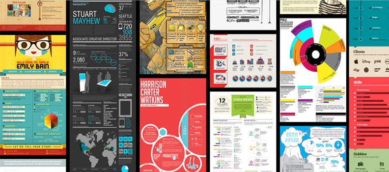
Don’t settle for bullet point lists. With the amount of infographic tools available like Piktochart, you can create beautiful infographics to represent your skills, experience, and more in a visually compelling way. Use icons, photographs, sketches and more. For some truly unique use of visuals in resumes, check out these examples compiled by Enhancv.
3. Let your personality shine.
While you should tailor your resume to the organization and position you’re applying for, you can also have a little fun with your resume when appropriate. Use more casual, conversational language at times and be a little cheeky if that’s your natural bent. Include personal hobbies, what you’re reading or listening to, favorite teams, and more. Of course, make sure it’s professional, i.e. use proper grammar and please use spell check.Now the point of making your resume fancy is not only to make it more pleasing to the eye; it’s also helpful in presenting all your important info in a way that’s easy to digest. Hiring managers are busy and they don’t want to have to scan through lines and lines of text to figure out that you might be their perfect next hire.
And don’t worry – if you can’t design anything yourself, there are plenty of templates you can purchase. Just do a Pinterest search for creative resumes and you’ll find a ton of inspiration and resources.
Happy resume building!
Image credit: Enhancv

